CLIENT
CAIR Washington State
ROLE
UX and Web Designer
PROGRAMS
Illustrator, Sketch, InVision
CAIR Washington State had difficult navigation due to unclear visual and informational hierarchy. I addressed two essential issues to user experience- a reorganization of their landing page and donation page flow.
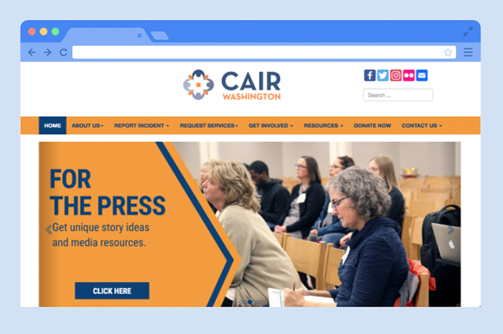
homepage: before
Assessment
It was difficult to immediately understand what CAIR Washington did. There was no hierarchy of information, visually or logically. Information was redundant. As a potential donator, it was difficult to understand how to donate to their organization. As a non-profit based heavily on donation, this was essential to address. Important information was trapped and hidden.
homepage: after

First, I prioritized their mission statement. "Empowering American Muslims" is a tagline that the organization expressed they wanted to incorporate more. I chose a preexisting photo from their database that visually explained their story. I also made their photo full width and removed the carousel.
The bootstrapped photo carousel had a lot of hidden information. Now, with the navigation bar set as sticky, the user can scroll to see the following section, "What we do". The three icons navigate to pages that correspond to the three main functions of the organization.
I made sure to work within brand guidelines for color and typography. I worked closely with the organization and development team to clearly understand what they needed.
navigation: before
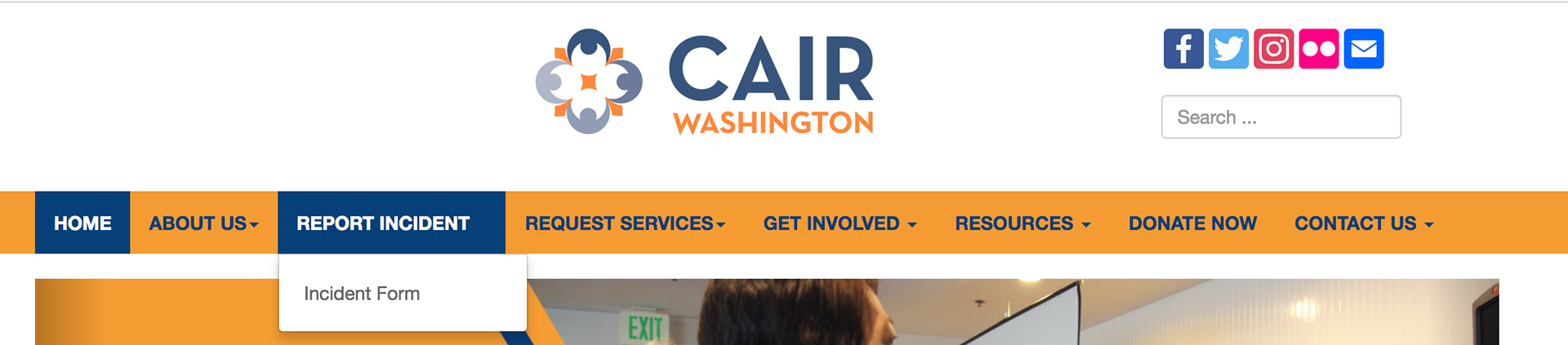

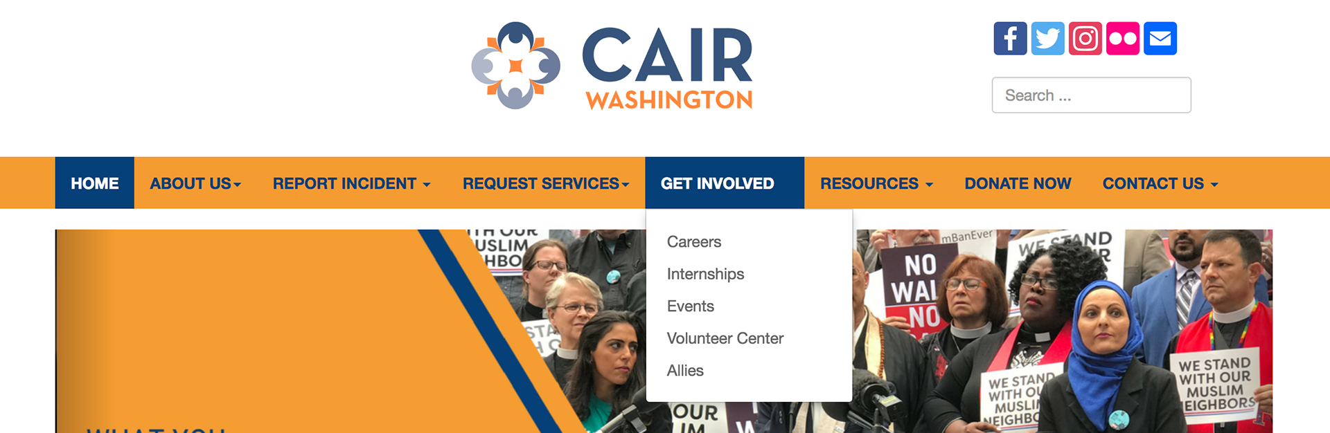
A closer look at the navigation bar shows redundant information. "Report incident" leads you to the same page as "incident form". I placed "get involved" in the footer. The lack of hierarchy made it overwhelming for any user to navigate the site.
navigation: after
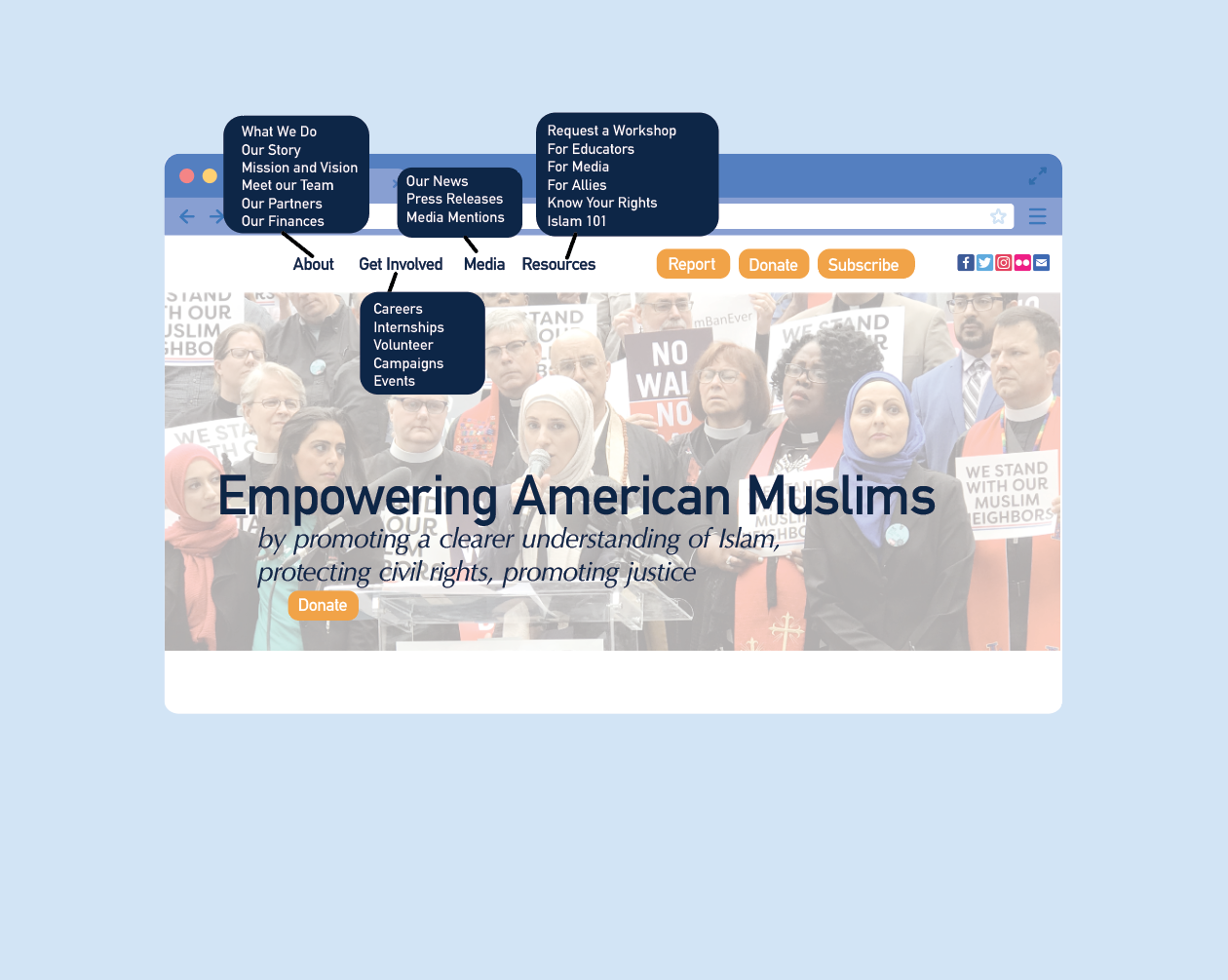
Working with the media team and head director, I made sure that the organization was in agreement with what information was most important. Through these meetings I was able to completely reorganize their navigation. The navigation is sticky so that the information locked at the top of the page.
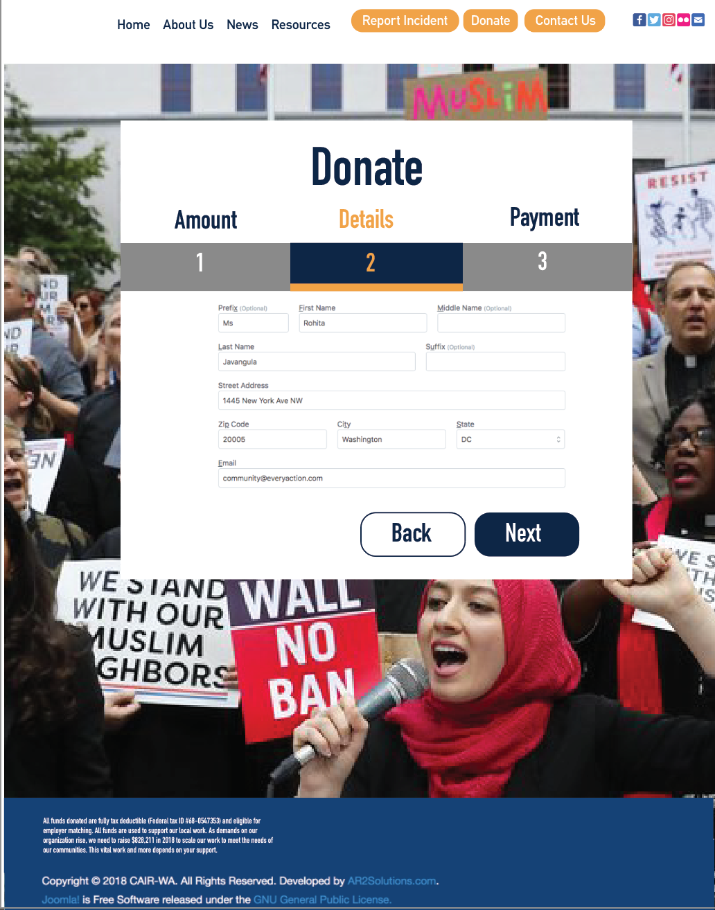
Donation Task Flow
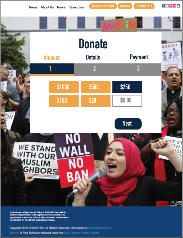
After the user clicks on the donate button from the homepage they are brought to this page. The three step process is clearly described at the top of the donate box, meanwhile, it is easy to navigate back to the homepage with the navigation bar. I chose grey text in white box to demonstrate that the user can enter their own amount. Once the user choses their amount, they can click next.
On the next page the user fills out their details. Again, the page is highlighted with CAIR brand colors to let the user know what page they are on.
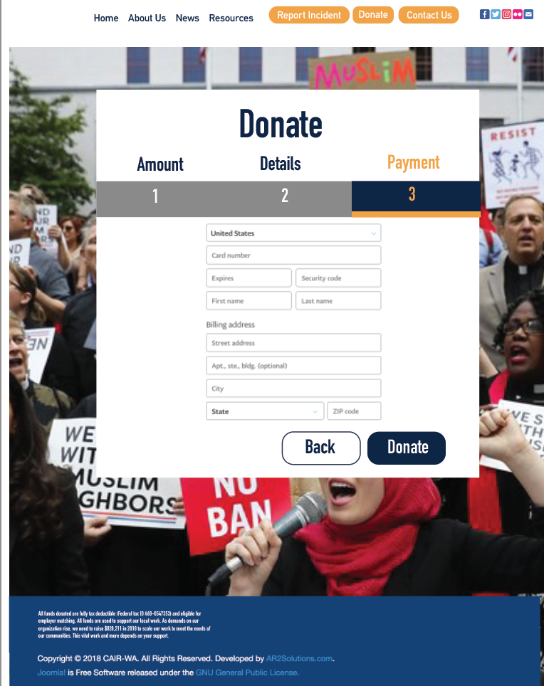
Page three of this user flow is the final page where the user is taken to the payment page. They can fill out their information and the button clearly shows "donate" at the bottom.


